

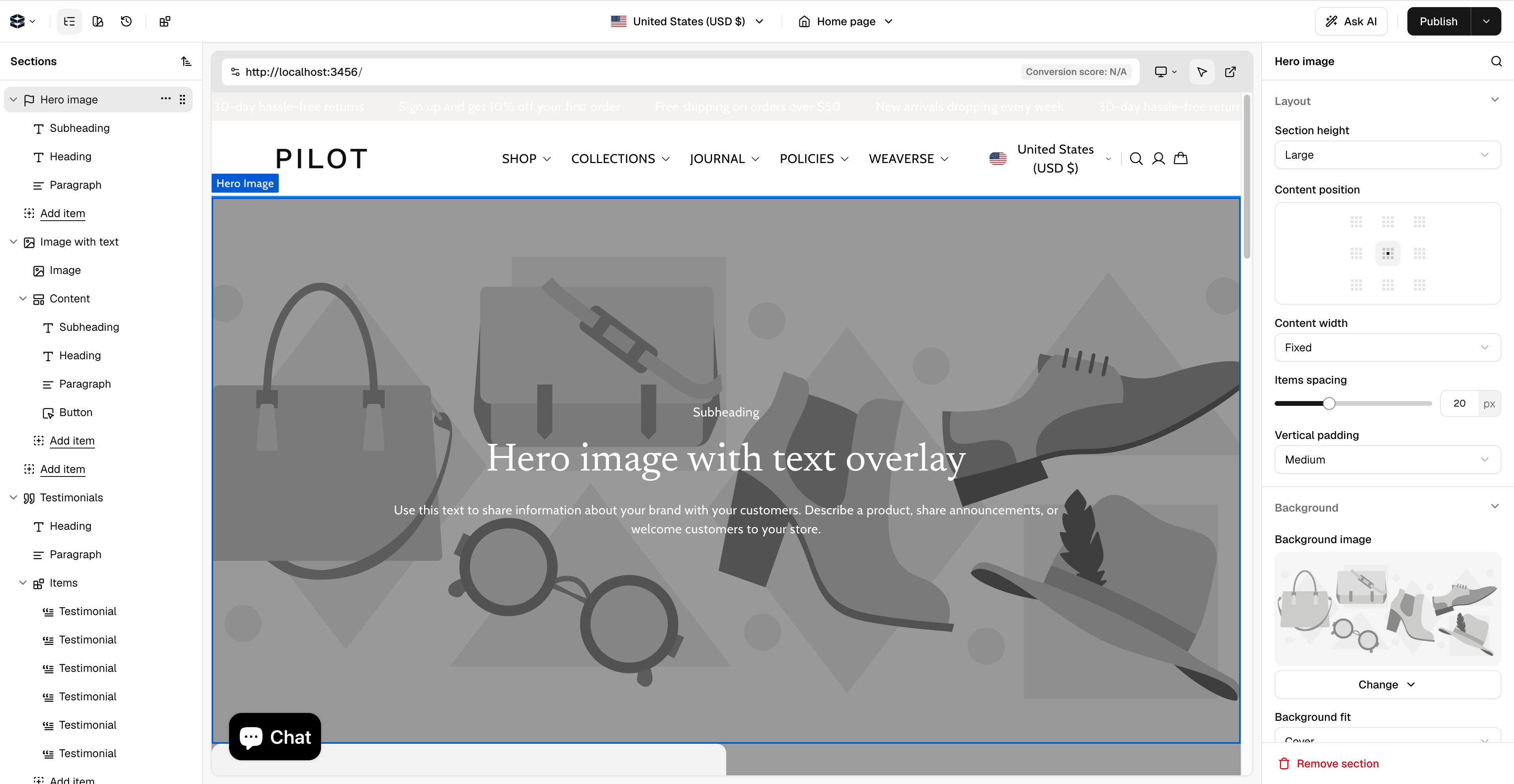
Top Bar: Page and Store Context
The top bar helps you choose what you are editing and which storefront context you are previewing.- Page search and selector: Find the page you want to edit. Pages are grouped by type, such as Homepage, Product pages, Collection pages, standard Pages, and Custom Pages.
- Locale or language controls: If your project supports multiple locales or the Translation Manager, use these controls to switch language context or open translation workflows.
- Store URL tabs: Switch between configured storefront URLs when a project has multiple preview contexts.
- Save or publish action: Save the current page changes so they can be used by the connected storefront.
Left Sidebar: Outline, Sections, and History
The left sidebar shows the structure and editing history for the current page.
- Page Outline: A tree view of the sections, blocks, and elements on the page.
- Selection: Click an item in the outline to highlight it on the canvas and open its settings in the Inspector.
- Reordering: Drag items in the outline to change their order on the page.
- Visibility: Hide or show a section while working on the page.
- Delete: Remove a section or element from the page.
- Add Section: Open the component library and add a new section from the components registered in your Hydrogen theme.
- Version History: Review previous saved versions and restore content when needed.
Preview Canvas
The canvas is the live, interactive preview of the page you are editing. Click a visible section on the canvas to select it, then edit its content, settings, or styles in the Inspector. The redesigned Studio workspace also includes a browser-style preview bar:- Preview URL selector: Choose or update the storefront URL Studio should load.
- Preview status: See whether the local or hosted storefront is connected.
- Performance signals: Review inline performance scores when they are available.
- Responsive preview: Switch between desktop, tablet, and mobile layouts to check the page at different sizes.
Right Panel: Inspector
The Inspector panel is where you configure the selected section, block, or element.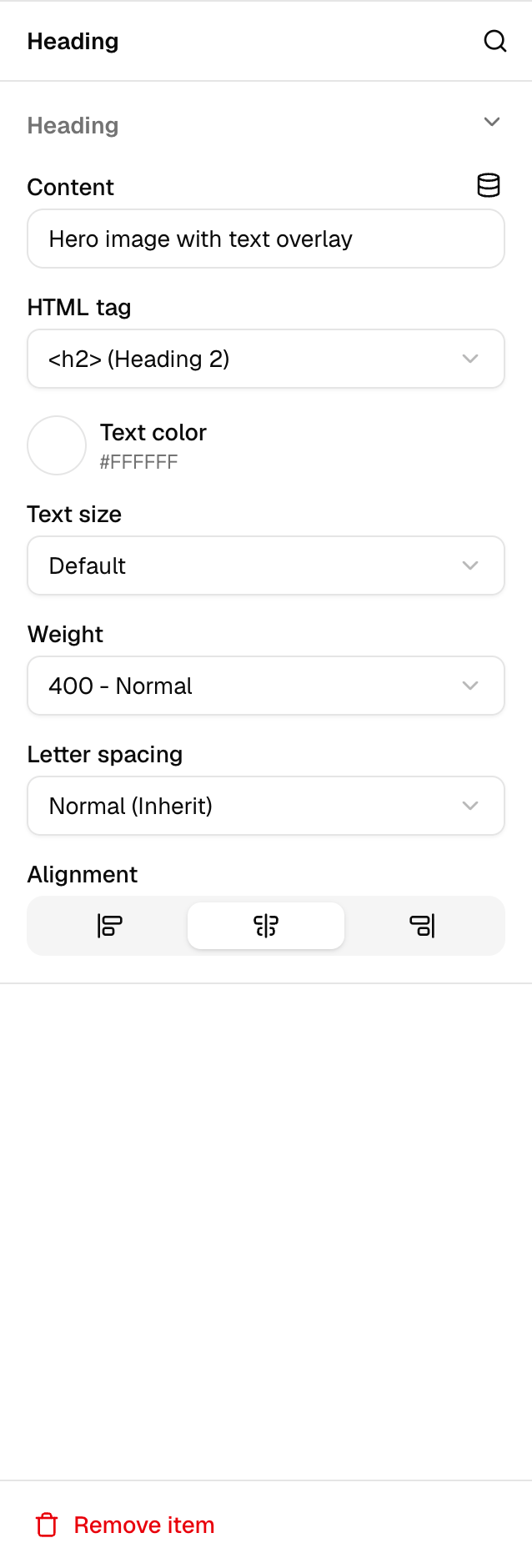

- Settings: Edit component-specific content and behavior. These fields come from the component’s
schema.settingsdefinition, such as text, image, product, collection, layout, and toggle controls. - Style: Adjust visual properties such as spacing, alignment, color, background, borders, and responsive layout options.
- General: Use common actions such as visibility, duplicate, and delete.
- Theme Settings: Edit global theme settings defined in
~/weaverse/schema.server.ts, such as brand colors, typography, layout defaults, and reusable theme content.
Studio Settings
Studio settings are available from the settings popover in the workspace. This popover consolidates project preferences, project details, and recent activity.

- Preferences: Manage editor preferences and workspace behavior.
- Project: View or update project-level settings, including the Project ID. This is the only Studio value a standard Hydrogen setup needs — copy it into your theme’s
.envasWEAVERSE_PROJECT_ID. - Preview URL: Configure the storefront URL Studio should load, such as
http://localhost:3456during local development. - Domains: Configure custom domains when your project uses Weaverse-hosted storefront features.
- Activity: Review recent project activity and editing history.
- Theme: View theme information such as name, author, and version from
themeSchema.infoin~/weaverse/schema.server.ts.
API tokens are not part of this Studio-to-Hydrogen setup. Content API credentials are generated separately (as
content_api tokens) and are only needed when an external application calls Weaverse’s APIs. See API Access.Common Editing Flow
- Select a page from the top bar.
- Add or select a section from the left sidebar or preview canvas.
- Edit content and styles in the Inspector.
- Check desktop, tablet, and mobile previews.
- Save your changes.