
Make your Hydrogen components visually editable
Developers expose their own React and Hydrogen components to Weaverse with schema-driven controls. Non-developers then compose pages from approved, on-brand building blocks.
Bring your own components
Register the React/Hydrogen components you already build. Weaverse makes them available in the visual editor instead of forcing a fixed set of generic blocks.
- Use your existing React/Hydrogen components
- Keep storefront logic and styling in code
import { createSchema } from '@weaverse/hydrogen'export let schema = createSchema({type: 'featured-collections',title: 'Featured collections',settings: [{group: 'Content',inputs: [{ type: 'text', name: 'heading', label: 'Heading' },{ type: 'collection-list', name: 'collections', label: 'Collections' },],},{group: 'Layout',inputs: [{ type: 'range', name: 'gap', label: 'Items spacing' },],},],})
Define what is editable
Declare component props and schemas so the team gets exactly the controls you intend — nothing more, nothing less.
- Type-safe schemas describe editable props
- Expose only the controls you want to expose
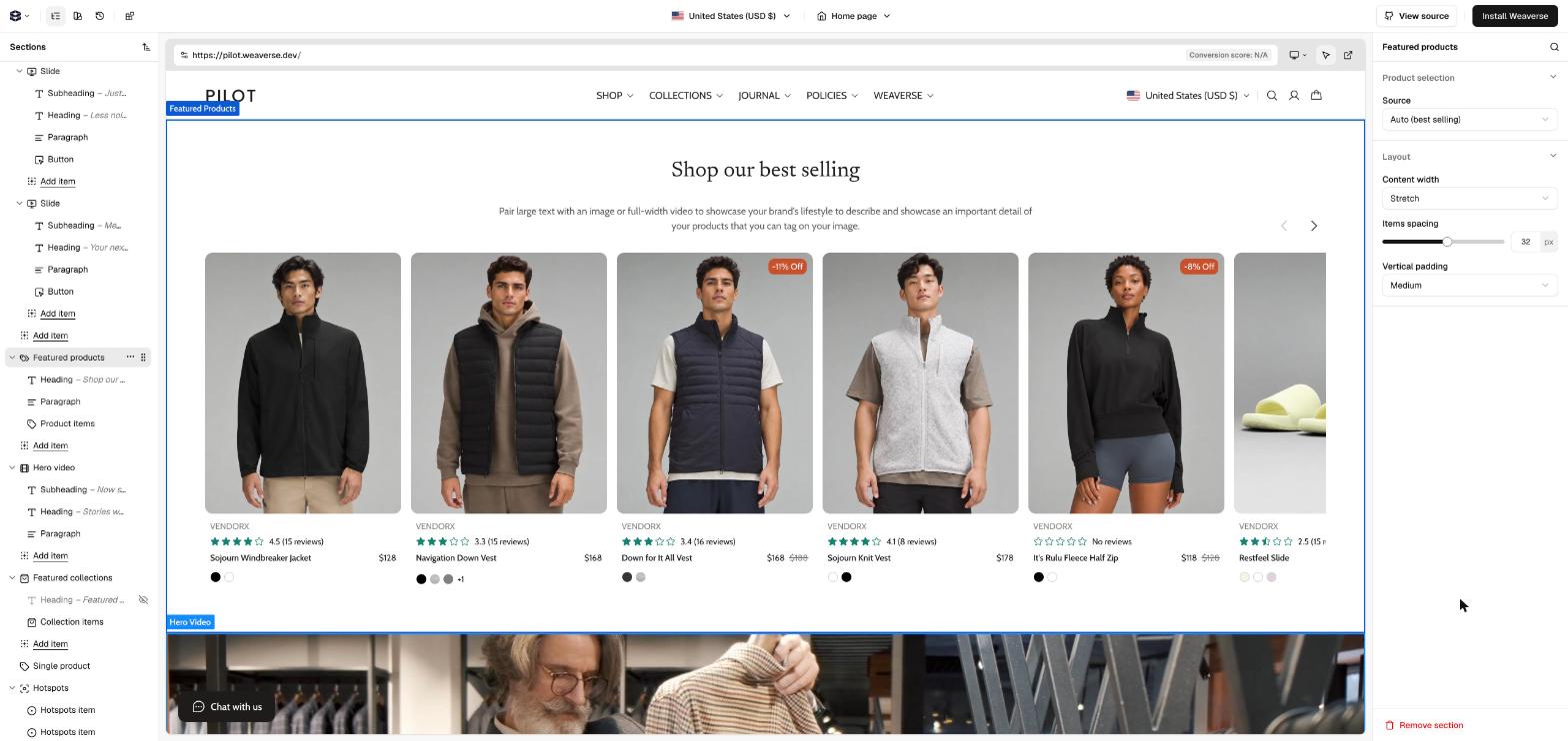
Compose without breaking things
Non-developers assemble pages from approved components, so marketing moves fast while the design system stays intact.
The core difference from generic builders
Weaverse turns your own Hydrogen components into the building blocks, so the visual editor reflects your real storefront and design system.
Frequently asked questions
Need a senior
Hydrogen team?
Weaverse builds Shopify Hydrogen storefronts, with scope, delivery and launch support agreed in a written statement of work.
