

Anatomy
Input allows developers to specify a set of configurations that merchants can adjust to customize a component. Each setting provides a specific control, from simple text inputs to complex selectors. Input settings are generally composed of standard attributes. We can classify them into two main categories:Overview
A quick look at aninput configs type:
Attributes Details
Here’s a breakdown of the available attributes in an input setting:-
conditionTheconditionattribute enables developers to define conditions under which an input will be displayed. It supports two formats:-
Function-based conditions (Recommended):
-
String-based conditions (Deprecated):
Note to users: String-based conditions are deprecated. For new components, we strongly recommend using function-based conditions which offer more flexibility and better type safety.
Function-based conditions receive the component’s current data and the Weaverse instance, allowing for more complex conditional logic that can reference multiple fields or perform calculations. -
Function-based conditions (Recommended):
-
helpTextThehelpTextattribute can utilize HTML, offering more expressive help instructions. This allows for the inclusion of links, emphasis using bold or italics, lists, and more. Example:Will appear as:data-line-numbers=false
Basic Inputs
heading
The heading input type is a special input that creates a heading or section title in the settings panel. It’s used to organize inputs into logical groups.
Example:

text
The text input allows merchants to enter a single line of plain text. It’s frequently used for capturing headings,
button text, or short promotional messages.
Return: string - The inputted text value.
Example:

textarea
The textarea input provides a multi-line text box suitable for longer descriptions, like testimonials, user reviews, or
shipping and return policies.
Return: string - The inputted multiline text value.
Example:

switch
The switch input provides a toggle option. This can be useful for enabling or disabling product availability,
promotional features, or customer reviews.
Return: boolean - Indicates whether the switch is turned on (true) or off (false).
Example:

range
The range input lets merchants select a value within a set range. This can be used for adjusting quantities, setting
percentages, or customizing display sizes.
Return: number - The selected value within the defined range.
Example:

configs details:
select
The select input provides a dropdown list, allowing merchants to select one option from a predefined list of options.
Return: string - The selected option’s value.
Example:

configs details:
toggle-group
The toggle group input allows merchants to make a selection from a group of toggleable options (only one choice is
allowed).
While it functions similarly to the select input, its UI is distinct, showcasing options as toggle buttons. This
makes it particularly useful and user-friendly for cases with fewer options, allowing for a more intuitive selection
process.
Return: string - The chosen option’s value.
Example (Display as Text):
 Example (Display as Icon):

configs details
💡 Note for icons:
- We use Lucide Icons library for the icons.
- The value is the Icon name (e.g: mail-search, bar-chart-horizontal…)
- Not all icons are supported yet. Please contact us if you need an icon that is missing from your configs.
richtext
The richtext input allows merchants to craft content using a rich text editor, providing flexibility and more
advanced text formatting options.
Return: string - A string containing rich-text (HTML) formatted content.
Example:
 🌟 Pro Tip: our
 richtext input comes with AI-powered content generation capabilities, allowing merchants to
effortlessly craft top-notch content, from descriptions to promotional texts and more.

image
The image input offers merchants the ability to select or upload images.
Here’s how it works:
- Media Manager: on open, it displays the Media Manager modal with all images from the Files page of the merchant’s Shopify Admin.
- Uploading Images: any image a merchant uploads through this input is saved to the Files page as well.
- Enhancing SEO: merchants can edit the alt text of the images they’ve uploaded.
- Focal point: merchants can pick the part of the image to keep in view when a section crops it. See Focal point.
Filtering the Media Manager gallery
A theme can hide files from the gallery so a picker only offers what belongs in it. Declare the store-wide default onHydrogenThemeSchema.media, and override it for a
single input through configs:
An input’s
configs overrides the theme value field by field:
- the key is absent — the input inherits the theme’s value
- an array or boolean is present — it replaces the theme’s value for this picker
excludeFilenamePrefixes: []— this picker shows every file, ignoring the theme’s list
media key filters nothing, which is not
an error.
Focal point
From@weaverse/hydrogen 5.23.0, merchants can click Change → Set focal point on an image input and pick
the part of the image to keep in view when a section crops it. The point is saved on this input’s value as
focalPoint: { x, y }, with both coordinates from 0 to 1 measured from the image’s top-left corner. It is
absent when no point is set.
The SDK only stores the point. To use it, set it as the CSS object-position of images rendered with
object-fit: cover:
object-fit: contain), since it would shift them off
center. See Pilot’s Image component
for a complete example.
Return: object - A WeaverseImage object with the following structure:
defaultValue in the input configuration can either be:
-
an object of the
WeaverseImagetype (where all properties are optional except for theurl) -
or a
stringrepresenting the image URL
 Usage
We highly recommend developers use the
Usage
We highly recommend developers use the Image component from the
@shopify/hydrogen package to render images. It’s optimized to work with the data returned from
the image input, ensuring efficient image delivery.
Here’s a simple example:
video
The video input offers merchants the ability to select or upload videos.
Here’s how it works:
- Media Manager: on open, it displays the Media Manager modal with all videos from the Files page of the merchant’s Shopify Admin.
- Uploading Videos: any video a merchant uploads through this input is saved to the Files page as well.
- Enhancing SEO: merchants can edit the alt text of the videos they’ve uploaded.
-
Filtering the gallery:
videoinputs accept the sameconfigsasimage— see Filtering the Media Manager gallery.
object - A WeaverseVideo object with the following structure:

color
The color input type allows merchants to select a color using a color picker. This can be handy for design-related
settings, such as background color, text color, border color, etc.
Return: string - A color in hex format (e.g., #RRGGBB or #RRGGBBAA if alpha is set).
Example:

datepicker
The datepicker input type provides merchants with a way to select a specific date and time, making it ideal for
scheduling content, setting event dates, or determining promotional periods.
Return: number - A timestamp of the selected date and time.
Example:
 💡 Parsing: The returned timestamp should be transformed into a readable date-time string, for example:
map-autocomplete
🚧 - Experimental feature, may not work as expected.
The map-autocomplete input provides merchants with a location-based autocomplete functionality. As merchants type in
the input, a dropdown list of suggested places appears.
Return: string - The selected location or place name from the dropdown suggestions.
Example:

position
The position input enables merchants to select a content alignment from a predefined subset of positions using
intuitive directional arrows.
Return: string - The selected content position from the following allowed values:
top left|top center|top rightcenter left|center center|center rightbottom left|bottom center|bottom right

blog
The blog input provides merchants with an intuitive search and select interface to choose a specific blog from their store.
Return: object - A WeaverseBlog object (type can be imported from @weaverse/hydrogen package).
Example:
 Similar to the
 product input, the preview will automatically revalidate and run the loader function when selecting a blog. Please use the handle or id of the selected blog to fetch the full blog data.
metaobject
The metaobject input provides merchants with an intuitive search and select interface to choose a specific metaobject definition from their store.
Return: object - A WeaverseMetaobject object with the following structure:
 Similar to other resource picker inputs, when selecting a metaobject definition, the preview will automatically revalidate and run the
 loader function. Use the handle or id of the selected metaobject to fetch the full data from the Storefront API.
collection
The collection input provides merchants with an intuitive search and select interface to choose a specific collection from their store.
Return: object - A WeaverseCollection object (type can be imported from @weaverse/hydrogen package).
Example:
 Similar to the
 product input, the preview will automatically revalidate and run the loader function when selecting a collection. Please use the handle or id of the selected collection to fetch the full collection data.
collection-list
The collection-list input provides merchants with an intuitive search and select interface to choose multiple collections from their store.
Return: array - An array of WeaverseCollection object with their respective IDs and handles.
Example:
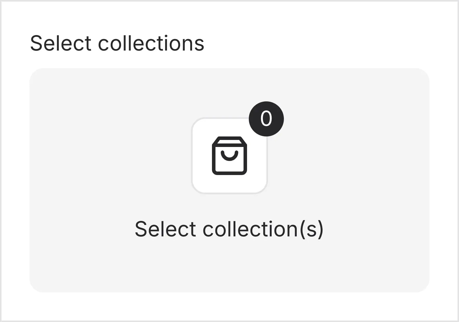 Similar to the
 product input, the preview will automatically revalidate and run the loader function when selecting collections. Please use the handle or id of the selected collection to fetch the full collection data.
Querying Storefront Data
After using the Resource Picker inputs, you might notice that the returned data is limited, typically just theid and handle of the selected resource. In most cases, you’ll need more detailed data for your components or routes.
This is where the Weaverse client comes in handy. Using its storefront.query function, you can fetch the full set of data related to your selection from Shopify’s Storefront API.
To learn more about how to effectively fetch and utilize data within Weaverse, refer to our dedicated section on Data Fetching & Caching.
Resource Picker Inputs
url
The url input allows merchants to enter a URL or select a page from their store using the internal link picker.
Return: string - The entered URL or the selected page’s URL.
Example:

product
The product input provides merchants with an intuitive search and select interface to choose a specific product from their store.
Return: object - A WeaverseProduct object (type can be imported from @weaverse/hydrogen package).
Example:
 When selecting a product, the preview will automatically revalidate and run the
 loader function.
The loader function will read the handle or id of the selected product and fetch all the product data from the Storefront API. Here’s an example of how to use the loader function:
product-list
The product-list input provides merchants with an intuitive search and select interface to choose multiple products from their store.
Return: array - An array of WeaverseProduct object with their respective IDs and handles.
Example:
 Similar to the
 product input, the preview will automatically revalidate and run the loader function when selecting products. Please use the handle or id of the selected product to fetch the full product data.
collection
The collection input provides merchants with an intuitive search and select interface to choose a specific collection from their store.
Return: object - A WeaverseCollection object (type can be imported from @weaverse/hydrogen package).
Example:
Similar to the product input, the preview will automatically revalidate and run the loader function when selecting a collection. Please use the handle or id of the selected collection to fetch the full collection data.
collection-list
The collection-list input provides merchants with an intuitive search and select interface to choose multiple collections from their store.
Return: array - An array of WeaverseCollection object with their respective IDs and handles.
Example:
Similar to the product input, the preview will automatically revalidate and run the loader function when selecting collections. Please use the handle or id of the selected collection to fetch the full collection data.
blog
The blog input provides merchants with an intuitive search and select interface to choose a specific blog from their store.
Return: object - A WeaverseBlog object (type can be imported from @weaverse/hydrogen package).
Example:
Similar to the product input, the preview will automatically revalidate and run the loader function when selecting a blog. Please use the handle or id of the selected blog to fetch the full blog data.
metaobject
The metaobject input provides merchants with an intuitive search and select interface to choose a specific metaobject definition from their store.
Return: object - A WeaverseMetaobject object with the following structure:
Similar to other resource picker inputs, when selecting a metaobject definition, the preview will automatically revalidate and run the loader function. Use the handle or id of the selected metaobject to fetch the full data from the Storefront API.
Querying Storefront Data
After using the Resource Picker inputs, you might notice that the returned data is limited, typically just theid and handle of the selected resource. In most cases, you’ll need more detailed data for your components or routes.
This is where the Weaverse client comes in handy. Using its storefront.query function, you can fetch the full set of data related to your selection from Shopify’s Storefront API.
To learn more about how to effectively fetch and utilize data within Weaverse, refer to our dedicated section on Data Fetching & Caching.